Have you ever wondered what to do with those data points you collect every day (if you don’t use software). These shows charts show some interesting points about my volume and how it compares to last year….I’m thinking that increased volume will help my times come down a bit, while maintaining relatively high intensity through the winter. Other points I’m thinking about taking in the future are average 500 and 100 yard times during 4x500 and 20x100 sets in the pool, continued 10k running times (see the last chart below!), and of course heart rate and times on the bike once I get back outside.
I normally don’t make charts, but I thought it would be interesting to see what they look like. Picture says a thousand words, right? By the way, these charts are easy to make and update in Excel….if you’re wondering and are so inclined.
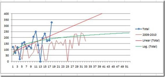
Here’s a look at my overall weekly point total. The red data line that goes along the x-axis is last year’s numbers. The straight red line is the lineal trend, and the curved green line is the log trend. You can see that my volume started out similar to last year and has now become much higher than last year at this time of the year. The last number in blue is my expected total for this week (HUGE WEEK!).
Next up is the weekly points totals. I’ve added my goal ranges to the right, beginning in mid-March. Red is bike. Green is run. Blue is swim. You can see how I started with running, added the bike, and then added the swim just a few weeks ago. See the run drop when I add the bike? See New Year’s Week when I did nothing? And the last two weeks you can see me getting into a consistent mode and building higher. I don’t expect to get much more volume than this week (usually a bit less probably!), but things should get consistent from here on out as I work all three sports.
Swim Volume. Just starting out. Last number is expected total for this week. I’m hoping to have consistent 8,000yd weeks March-Sept. Last year, 8,000yds was a very high week.
Bike: Volume in miles (y-axis) is definitely bigger than last year, but not as much bigger like I had thought. I’m really looking to get those blue lines close to 150 each week. I can feel the improvements, for sure.
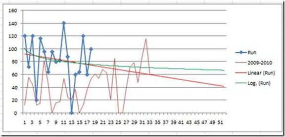
Run: Started out great, and you can see how I’ve dropped running volume while adding the bike and swims. I’m now getting things figured out, and the running volume should again get consistent at 25-30 miles / week (100-125 points/week). One run point = 1/4 mile.
Proof that consistency works! Here’s a chart that shows the same course done consistently with the same effort level at the same time every day. Far left is Oct 1, and far right is end of December…there are some gaps. Each data point is an individual run on my standard 10k lunch course; and it was important to me to always try to run at the same moderate perceived effort level. The red line is the trend line. What isn’t shown in here is the addition of the bike volume in November (yet times continued to go down), and the change in weather to an early winter and snow coverage (mid-November). Nor does it show me gaining about 6-8 pounds when I quit dipping. Even with all of those things that should have slowed be down, I got faster. That’s enough evidence for me to get the heck out of bed every morning and BE CONSISTENT in whatever I am doing.
Overall points averages are below. Top line is 2011 (beginning in Oct 2010). Bottom line is 2010 (entire year Oct 09 – Sept 10).
year overall swim bike miles run
100yd/pt 1 mile/pt 4pts/mile


No comments:
Post a Comment